Personal concept · Game UI / UX
I built this the week after the Witcher IV trailer dropped — not as a portfolio piece, just to answer a question I couldn't stop thinking about: if Ciri moves faster and colder than Geralt, what should her interface actually feel like? I posted the result on Reddit when I was done. It reached 260k views.
The starting point was the cinematic trailer shot of Ciri charging a monster from an angle that almost felt like gameplay. I used that as a constraint: what would the HUD, sign switching, and progression screens need to communicate if the game moved faster and felt more physical?
Community reception
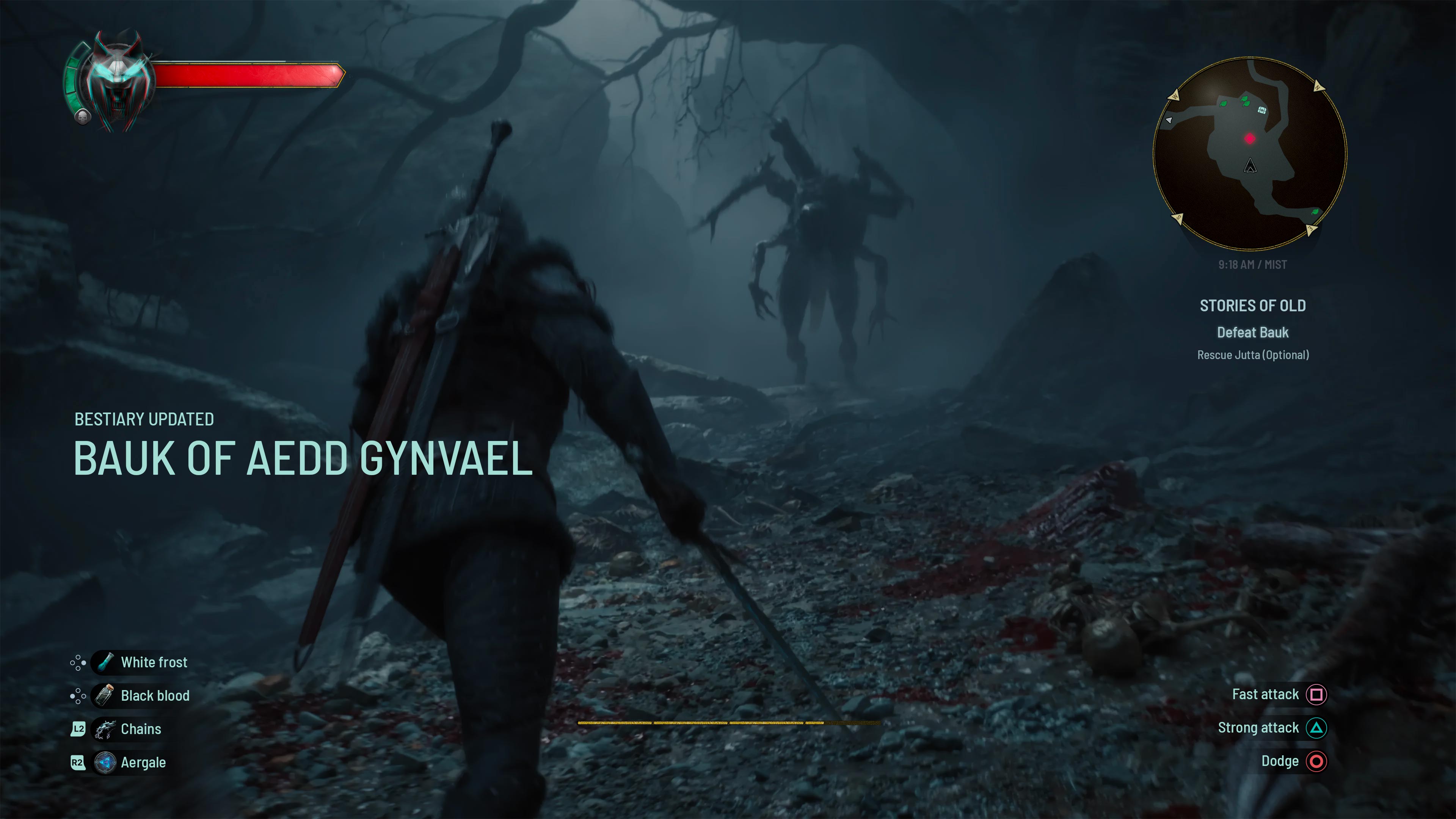
I started with the HUD because this is where player habit, combat readability, and fantasy meet. The Witcher already has strong interface memory, so the goal was not to redesign it for novelty.
The biggest visual shift is the move from earthy browns toward a colder blue palette. It creates distance from the Geralt-era UI while still feeling grounded in the same world.
I explored two directions: traditional and minimal. The minimal version is cleaner, but for this concept I would lean traditional. The Witcher is dense and atmospheric; the UI can carry some of that weight as long as it does not fight the action.
The HUD is divided into five main areas:
The medallion and health bar stay in the top left. I considered moving them closer to the action, but in this case the familiar placement matters. It gives returning players an immediate sense of home before the new systems start asking for attention.
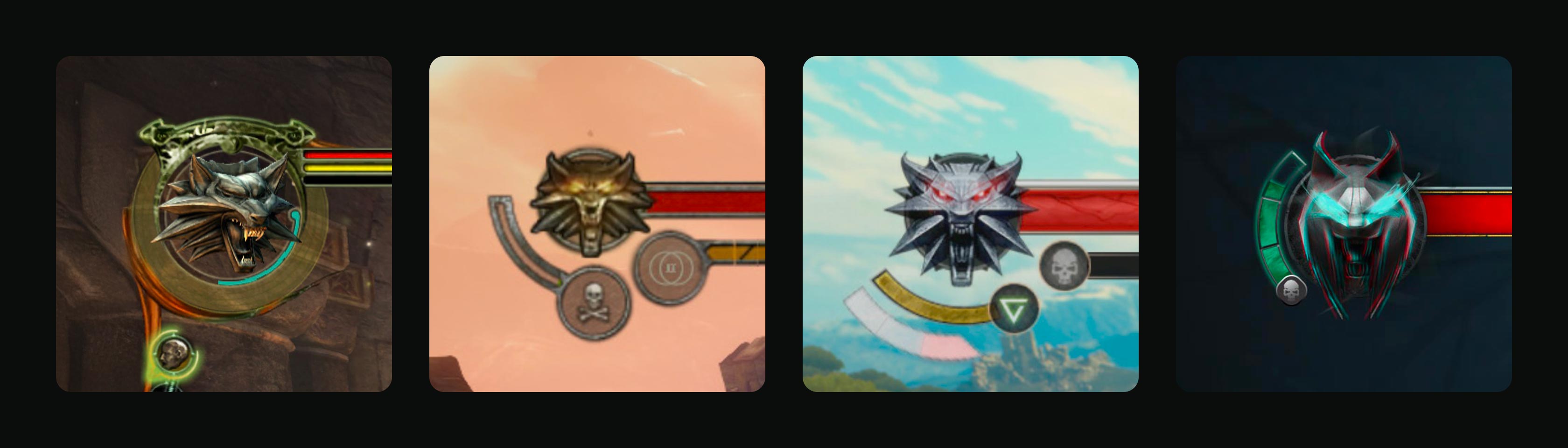
The medallion is iconic, so moving it too far would make the HUD feel unfamiliar before the player understands the new systems.
Keep the health and medallion anchor in the top left, but shift material, contrast, and color toward Ciri’s colder visual direction.
Returning players get immediate recognition, while the UI still signals that this is not simply Geralt’s interface reused.
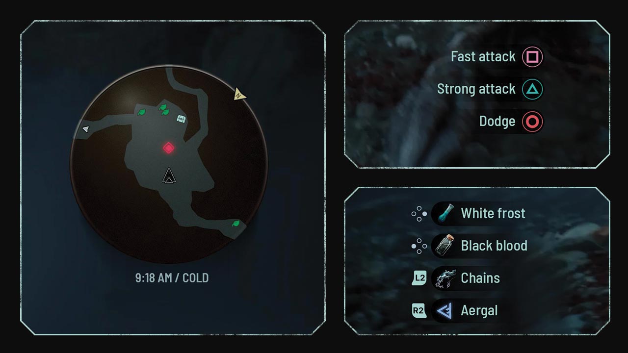
The map is essential, but it can easily make exploration feel too prescribed. I would explore a more flexible navigation layer: fewer permanent markers, stronger optional toggles, and a reduced-HUD mode for players who want to read the world instead of follow icons. It would only work if the quest and level design supported it, but that is exactly why it interests me.
The items in the bottom left follow a similar structure to The Witcher 3. I added gamepad input hints because many players return for the story and take long breaks between sessions. I also replaced the crossbow with the chains shown in the trailer. If this is a new Ciri weapon, it deserves to be visible early in the interface language.
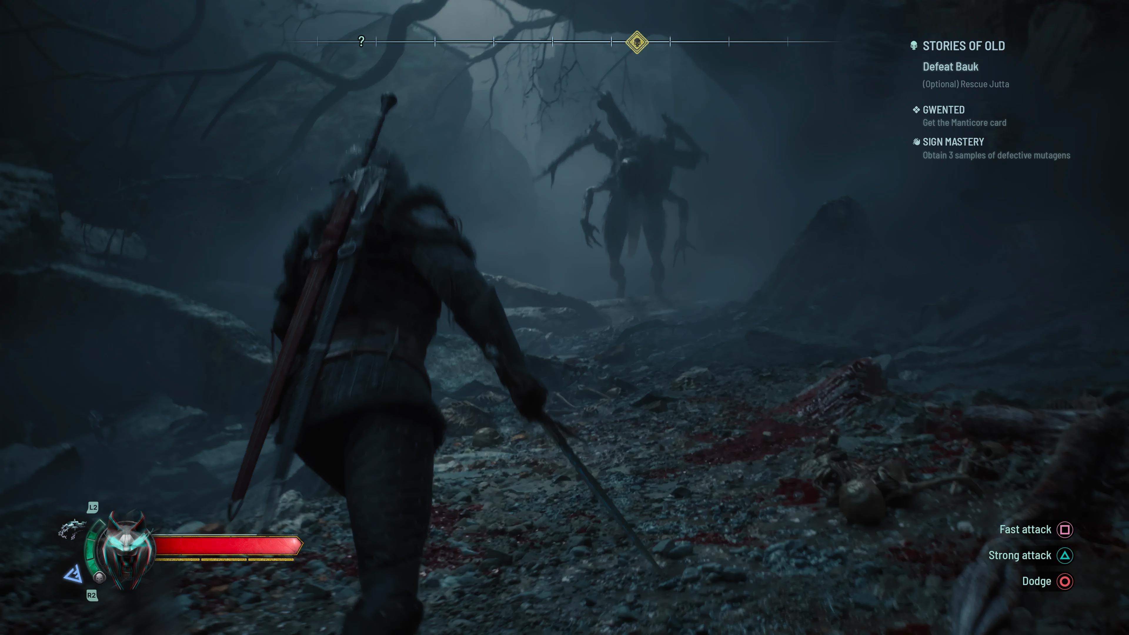 Minimal
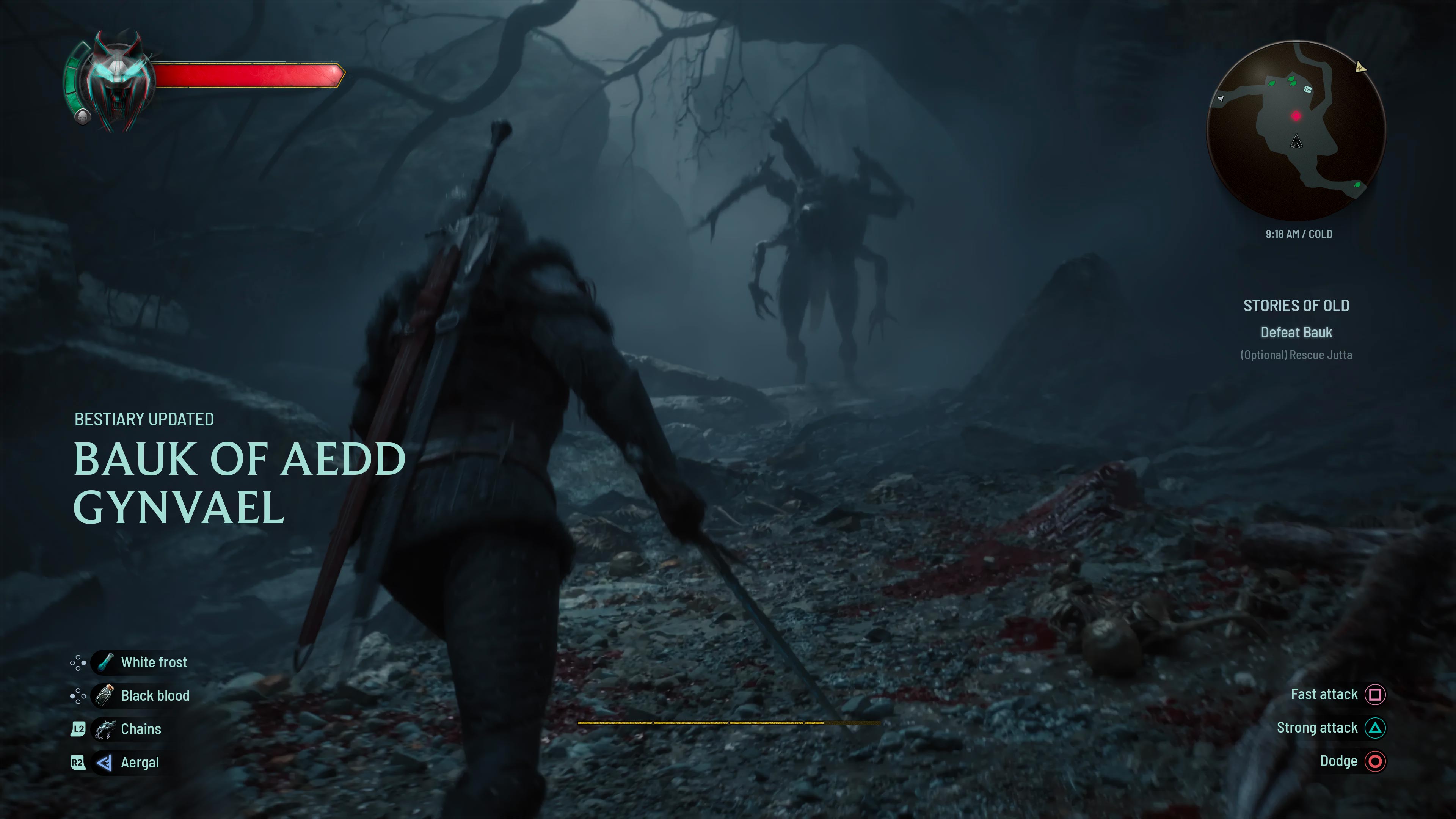 Traditional
The controls in the bottom right change with the situation. In combat they show available actions; in calmer spaces they become contextual interactions. I like this approach because it keeps the interface tied to what the player can do right now.
The final HUD change is the placement of stamina and status effects. In The Witcher 3, stamina lived near the medallion. It was tidy, but it also pulled the eye away from combat.
I moved stamina to the bottom center so it stays closer to peripheral vision. The bar remains segmented into four parts, keeping continuity with the previous game. Status effects sit above it: visible enough to matter, but not so central that they cover the fight.
Stamina is time-critical in combat, but placing it beside the medallion pulls attention away from the center of the screen.
Move stamina and status effects toward the lower center, close enough for peripheral reading without covering the fight.
The HUD keeps Witcher continuity at the edges while putting the most urgent feedback closer to the player’s combat focus.
After the static HUD, I wanted to solve something more interactive: switching abilities while the player is under pressure.
The Witcher 3 already uses a radial menu, and I think that pattern still makes sense. It is fast, predictable, and works well on a controller. I kept that foundation, but pushed the signs into a clearer visual focus.
In this concept, Ciri has six signs, including a new one: Aergal. I placed the signs mostly in the upper half of the radial menu so the player reads them as the main action layer, with items and other options supporting them.
When the menu opens, the world slows down and the background becomes darker, blurred, and slightly grainy. The goal is simple: the player should still feel the game world behind the UI, but the decision layer must be unmistakable.
The radial menu behaves like a pause in pressure, not a separate screen. Signs stay visually dominant and supporting actions fall back.
Health and medallion remain familiar. Stamina and status effects move nearer to the lower center, where players can read them peripherally.
Locked signs and upgrades can be tied to quests, encounters, or places, making discovery part of the interface.
The talent tree was the natural next step because it brings together many pieces of game UI: tabs, tooltips, locked states, character stats, progression, and discovery.
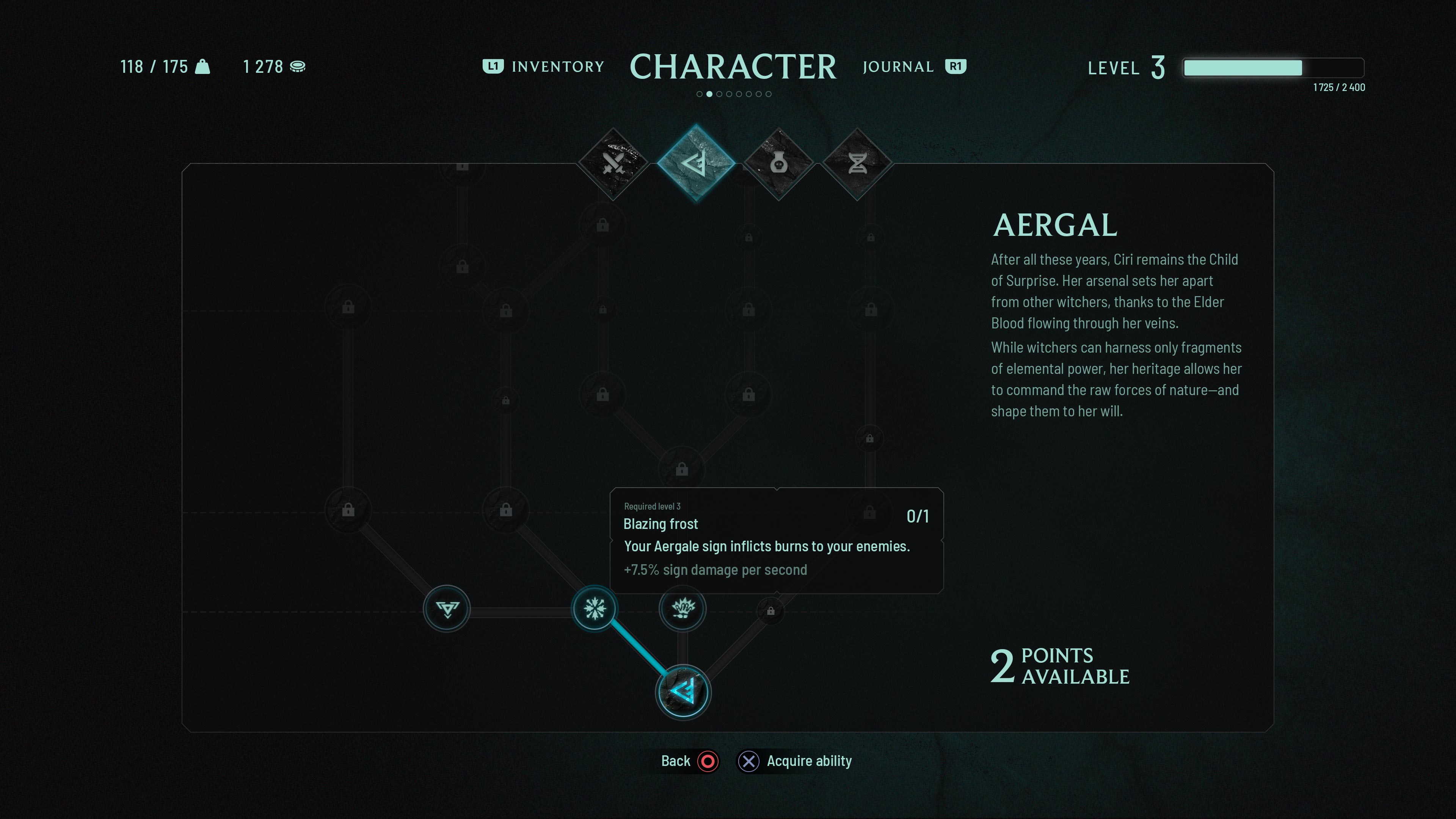
Progression screens can flatten discovery by exposing every future ability as a checklist from the start.
Use clear categories for orientation, but allow key signs and upgrades to stay obscured until they are discovered.
The interface supports progression while preserving a sense of forbidden knowledge, places, quests, and encounters.
The layout takes inspiration from both The Witcher 3 and Cyberpunk 2077. Cyberpunk’s tabs are clear and efficient. The Witcher 3 feels more restrained and atmospheric. I tried to combine both: readable navigation, but with a calmer composition that still belongs in a dark fantasy game.
For this concept, the tree is divided into four categories: swords, signs, alchemy, and mutagens.
I grouped all signs into one area because I wanted them to feel like something the player studies and uncovers, not just a set of abilities available from the start. Some signs could unlock through key encounters, level progress, or specific prerequisites.
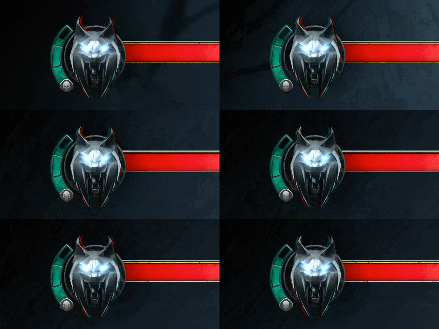
I explored an animated medallion that reacts to its environment: trembling near monsters, pulsing during active combat, and stilling when the world around Ciri is calm. The goal is to give the medallion a role in gameplay communication — not just visual identity. It works as a secondary health and threat signal that doesn't require the player to look at any specific part of the screen.
This could work similarly to gear hunts in The Witcher 3, where progression is tied to the world instead of only to menus. A sign upgrade could come from a quest, a monster, a place, or a piece of forbidden knowledge.
Ciri’s version of the signs is built around Aergal. In the trailer, she combines water and lightning, which hints at a more unstable and physical kind of magic. I would use that in the UI too: some high-level abilities could stay obscured until discovered, so the interface itself keeps a little mystery.